What is ServiceNow Community?
A place for ServiceNow Professionals come to learn, solve problems, build connection, support each other, suggest new ideas to admins, report bugs, and much more.
My Role
User Researcher
User Experience Designer
User Interaction Designer
User Interface Designer
Business Goals
Increase engagement
Find a way to increase user engagement on the platform.
Migrate users seamlessly
Migrate users from the legacy product to the new ServiceNow Community without friction at any level.
User Research
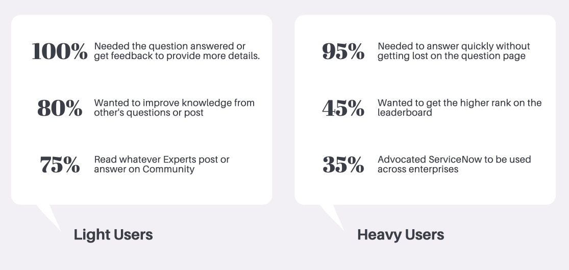
We identify the two user groups using the platform. Light user is the majority of the users, and another group is a heavy user.
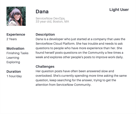
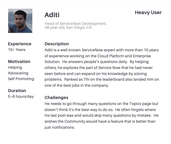
User Profiles
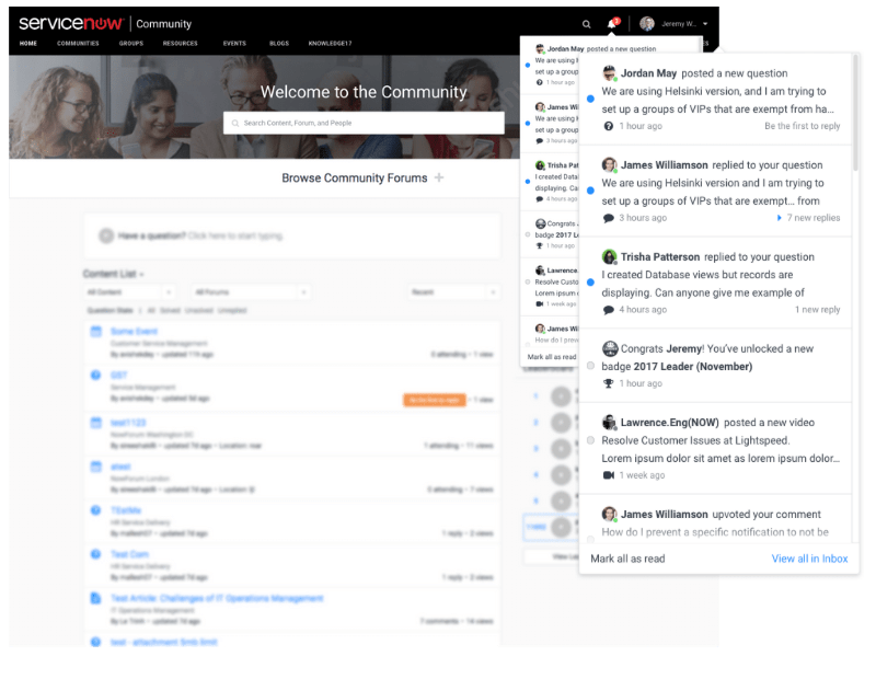
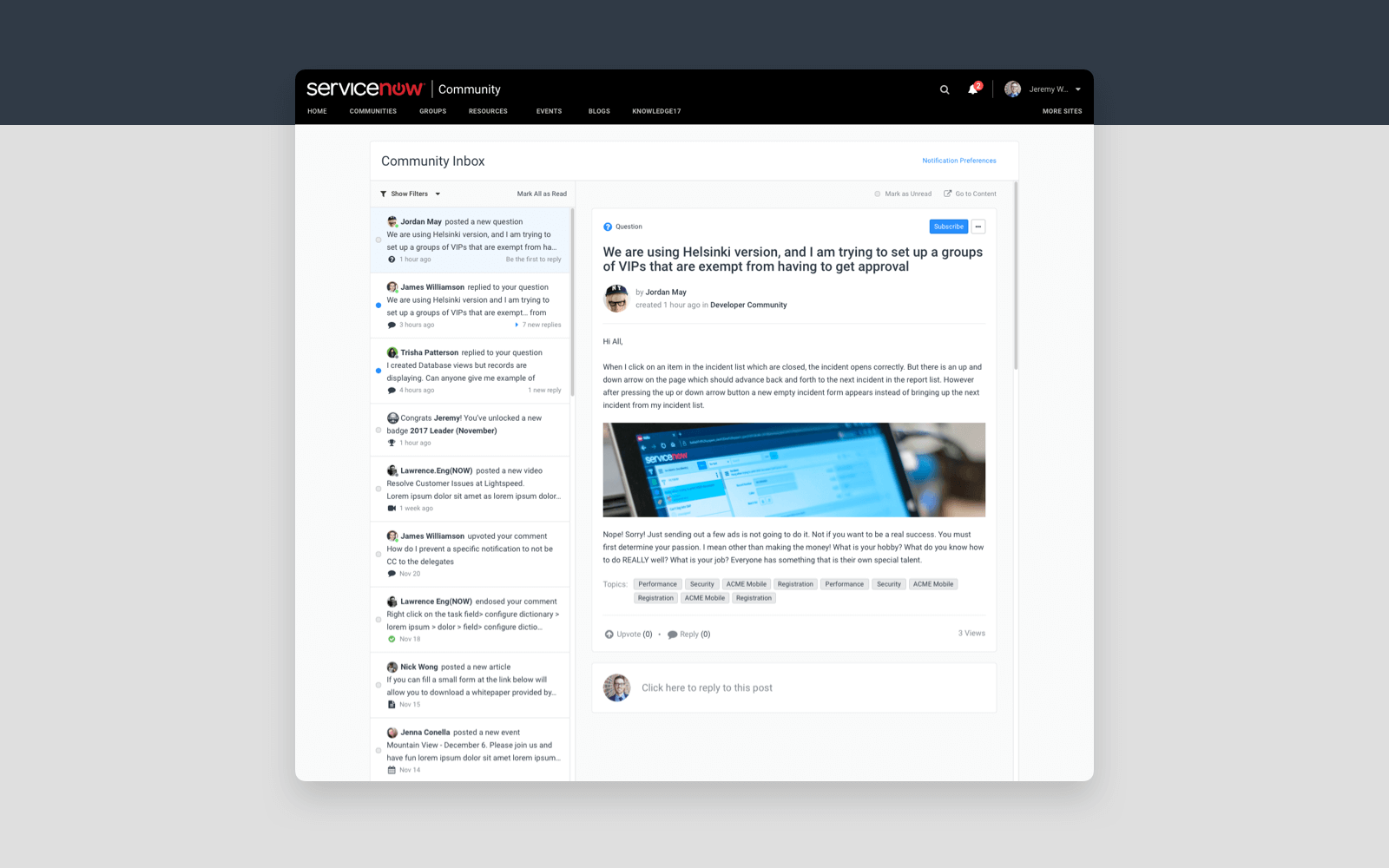
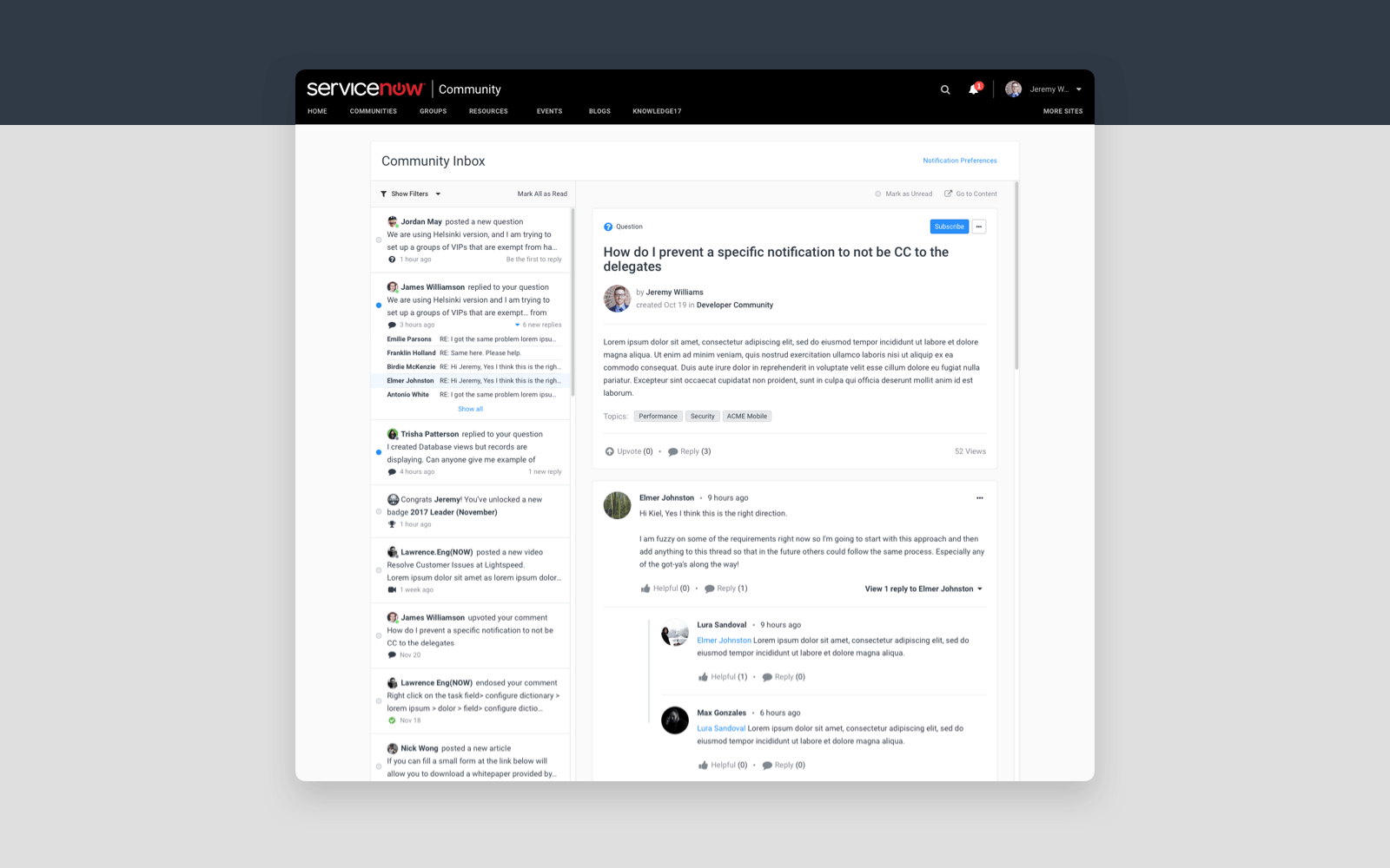
We went back to our drawing board and analyzed why users were not as engaged as they should be. Using the data we collected, we found a feature that was not performing well, and it had a lot of potentials to increase engagement between the two user groups—Community Inbox.
Customer Insights
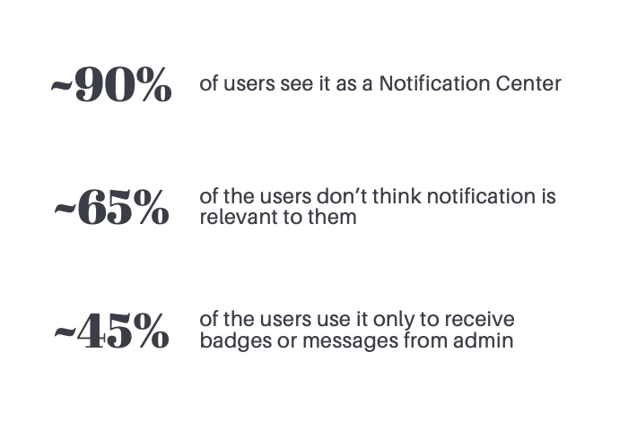
What is it used for?
Most users use it as a Notification Center. Receive Comments, New followers, badges, etc.
What can they do here?
Not much can get done here. Mainly for light users to receive the notifications.
How long do they use it for?
Most users come and immediately go to other pages
Problem Statements
Questions don’t get answered
How can we make sure the questions users are asking will be answered, and the experts will not miss any of them.
Notifications are not enough
How do we take this enormous Community and simplify it so an expert can efficiently work in that space, while the users can complete their tasks.
Ideation
Wireframes
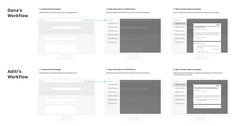
OPTION ONE:
Side Pane + Popups
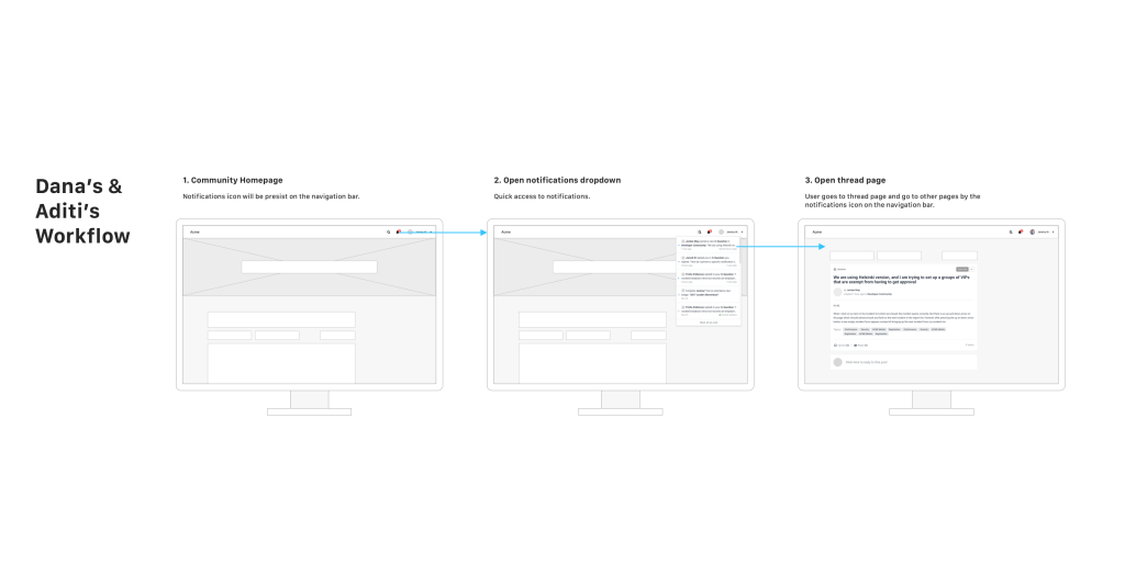
OPTION TWO:
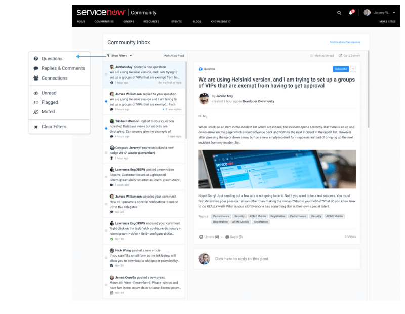
Dropdown
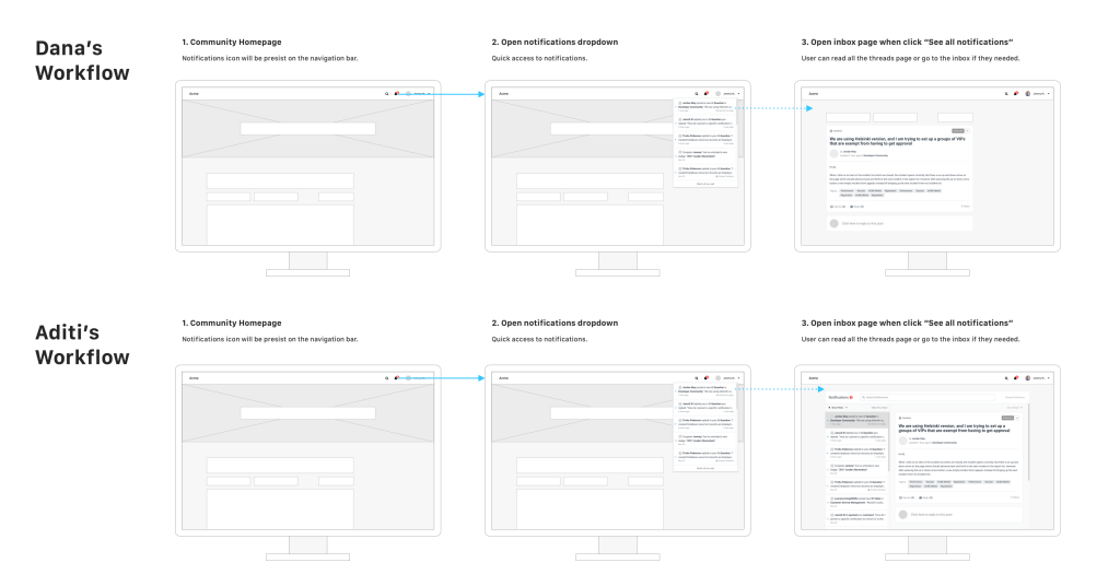
OPTION THREE:
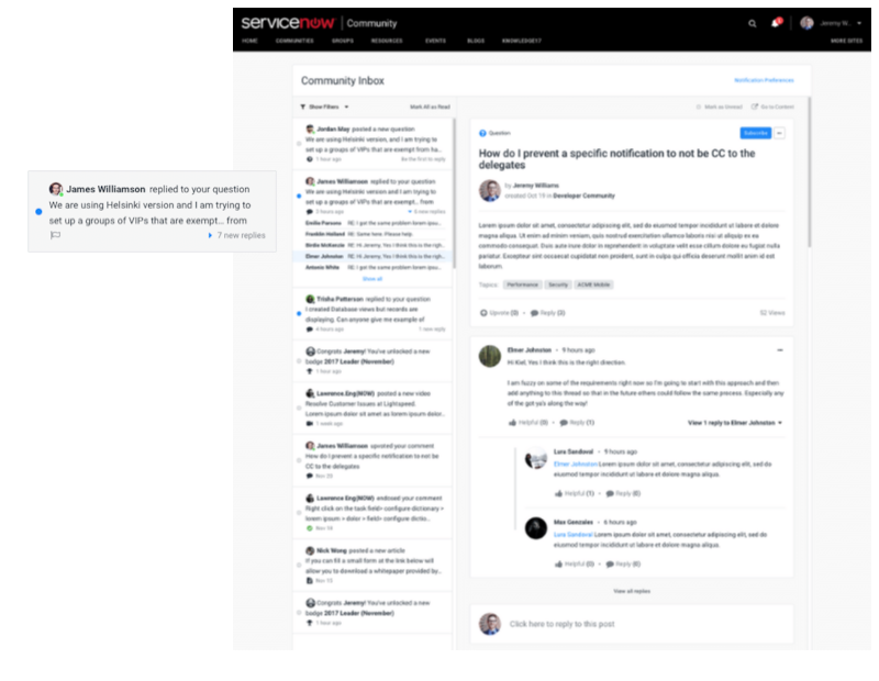
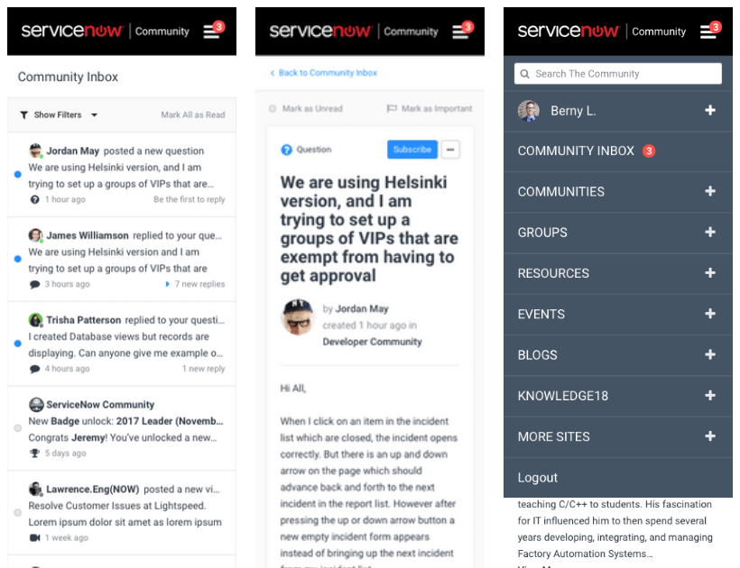
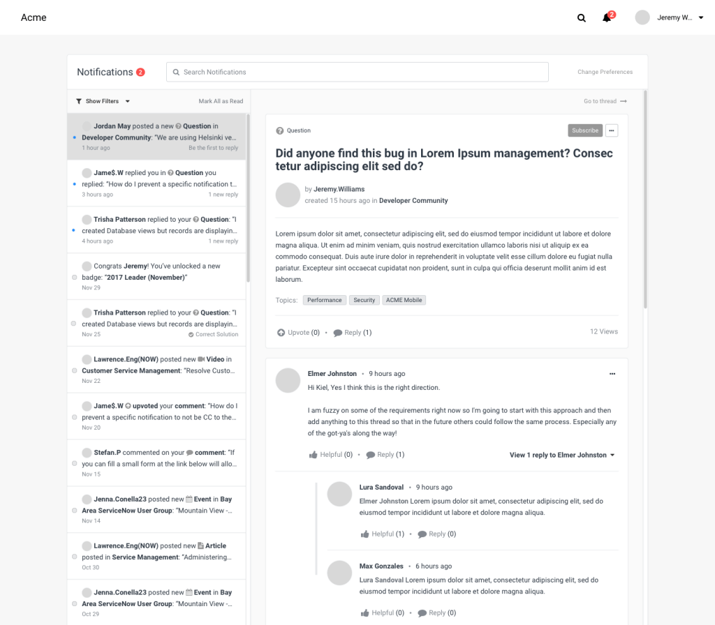
Dropdown + Email Inbox
Learning From Wireframes
Light users are happy as long as their problems get solved
They don’t really care if they get a badge or if anyone else posts questions. They just need a few things from this feature.
Need to be organizable
Heavy users also need the ability to filter or organize the notifications (rearrange, delete, manage subscriptions, etc.)
Popup/dropdown can’t get the job done
For heavy users, pop-up or dropdown menus are not enough. Sometimes side panels are just too far off to the side of their large work monitor.
Stability is key
Easy access everywhere is good, but it is not the most important. Option three stands out the most as a standalone page, and questions can be answered quickly.
Ideation Summary
We decided to focus on heavy users because they bring the most value to the community platform.
More Testing
After the wireframes testing, we decided to go with the email style notifications center and create another challenging design in the same approach to make sure we made the right decision of only focusing on the heavy users.
By focusing on one type of user allows us to focus and put resources into the right place.
Low Fidelity
Split view
Split view provide quick and easy access to all of notifications with one click.
Low Fidelity
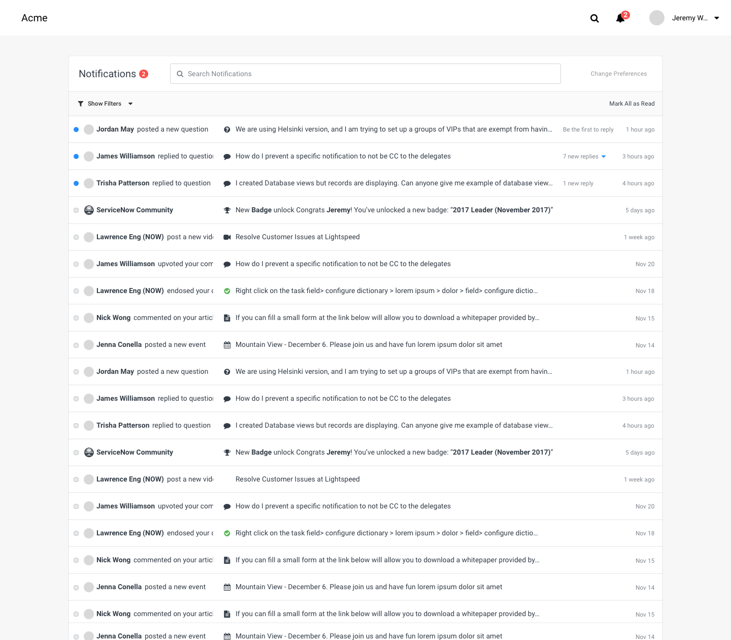
list View
List view providing quick and easy glance of all notifications that user can skim through.
Learning From Low-Fidelity Mockups
Stability is still the key
The need to click and come back to main page is still a hassle for users.
Some distractions are acceptable
New notifications might distract users, but it’s better than leaving questions unanswered
“Notifications” is not an accurate name
Notifications don’t sound important and discourage users from checking them
Search is unnecessary
We thought the users might need to use search to find old posts they answered or would like to answer, but that did not happen. They are most likely to bookmark the post or pin the notification.