Process
Setup the foundations of the system
Create an eco-system that is flexible, well-defined, well-documented (artboard sizes, page structures, spacing, and etc.) where each component can fit right in place and work without adjustments
Define interfaces and interactions
Create pixel-perfect interface and interaction library with the smart symbol and design token, including documentation for designers and engineers to use.
Collaborate with teams
Working inside the Experience Design Organization to support them and make sure they have everything they need to make the design process as easy and smooth as it can be
Why Do We Need the Design System?
Hi Service Portal is the collection of products that come together into one product. Some were legacy designs from 20 years ago, and some are very new.
We need to unify the experience as one enterprise-level entity. By creating a design library for designers and design token for engineers, it creates a smoother and faster workflow for them.
Setup the System
We started with research inside the design organization to see what artboard sizes, spacings, and font sizes they are using. Especially, the grid system that designers misunderstood how it behaved for years before this design system project started.
We discussed with the engineering organizations to see what is the technology they are using for the structure of the products.
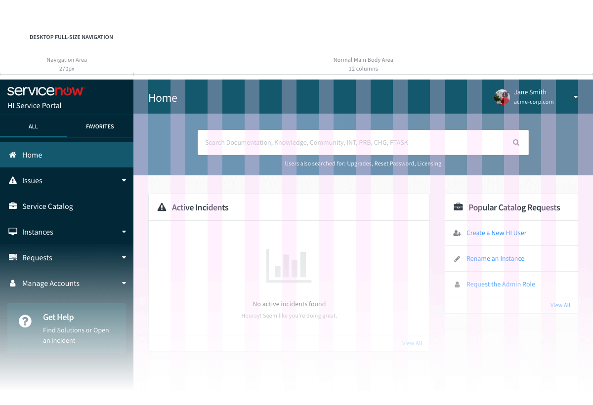
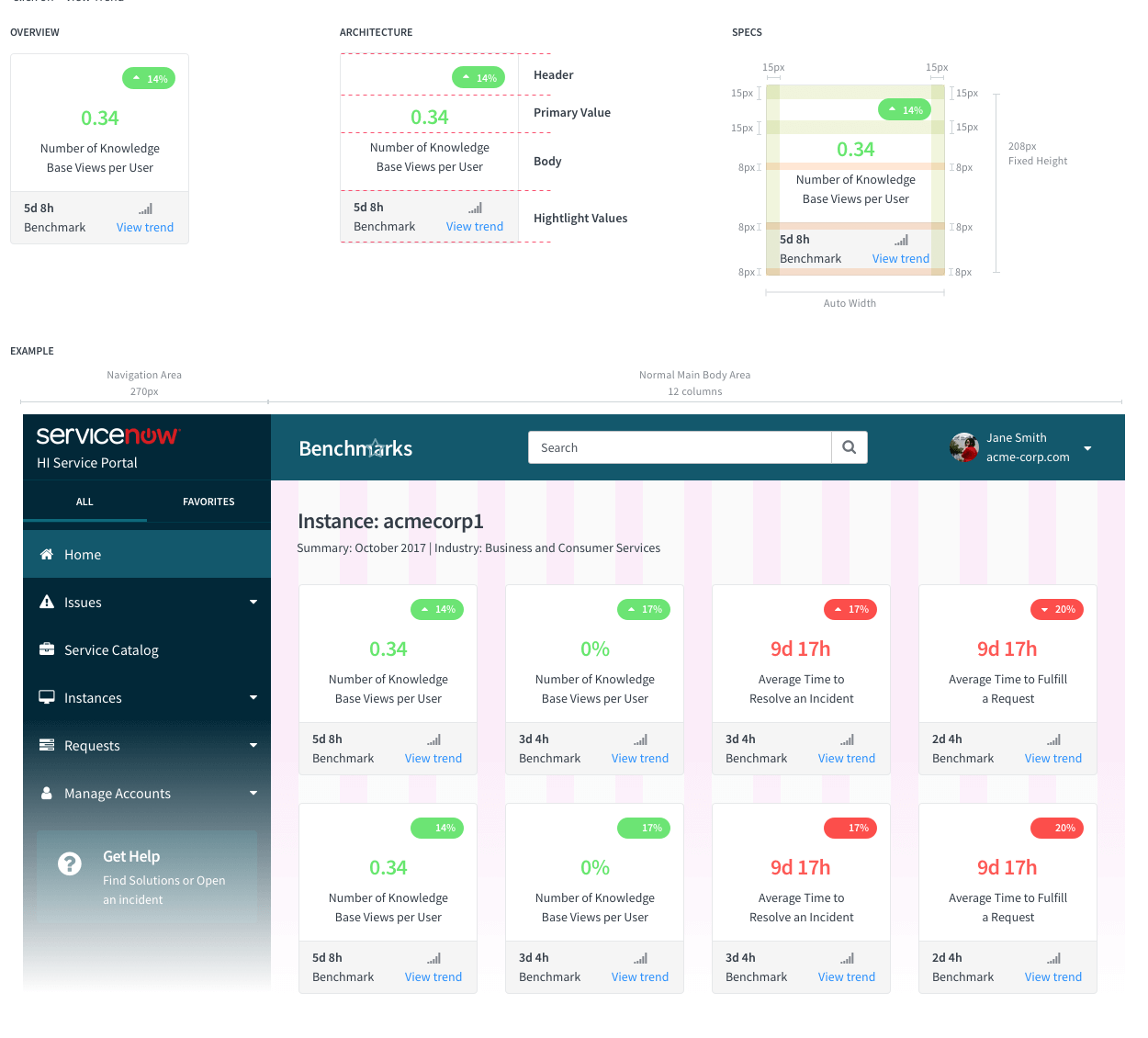
Grid Structure
We found that we misunderstood the grid system and how it behaved. The engineering team excluded the side navigation from the grid system, while design files are including it.
We set up the grid system based on the engineering team’s feedback to the actual structure of the product, which is Bootstrap.
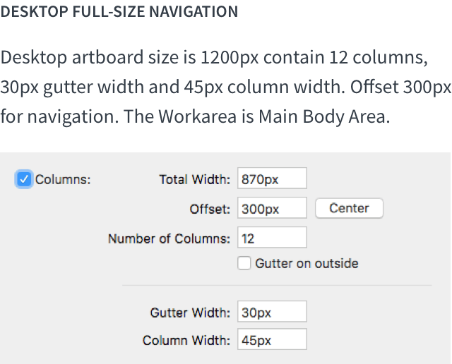
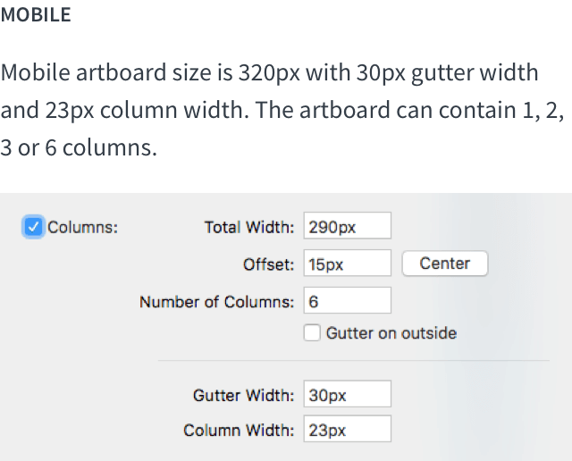
Artboards
The variety of artboard sizes can create friction on reusing components from other designers and design libraries.
We set up the standard artboard sizes, and gutters to improve the design process.
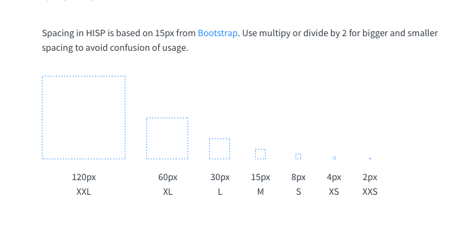
Spacings
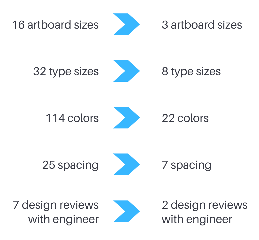
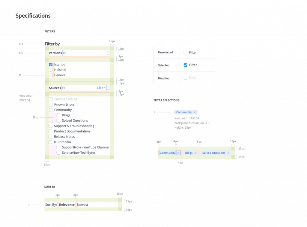
We went deeper into each component and found there are 45 variations in spacing alone.
To reduce the number of variations, we decided to set the spacing base on 15px from Bootstrap, and this clears up the cognitive load from the designer’s mind.
Even if the designer made a mistake and didn’t deliver a pixel-perfect mockup engineer team can guess how much spacing designer intended for it to be.
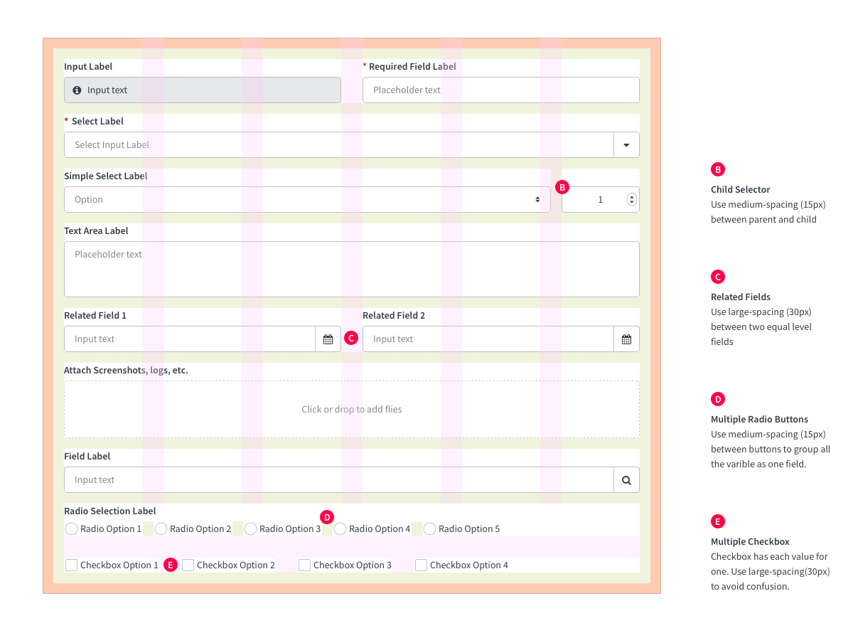
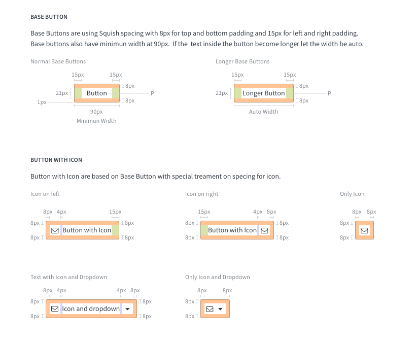
Standardization
To optimize the number of variations across products, we put efforts cleaning up many components and built a design library, and design tokens for designers and engineers to be able to reuse.
We documented every single component on how they should behave, where can they be used, and how to use it with a proper UX pattern.
Accessibility
We made sure the components are up to the industry standard on accessibility.
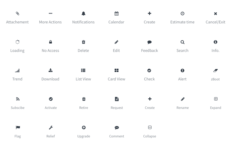
Icon Name in action
Name each icon in action for the screen reader to go through smoothly. Reduce time spend on providing annotation for each interaction for designers
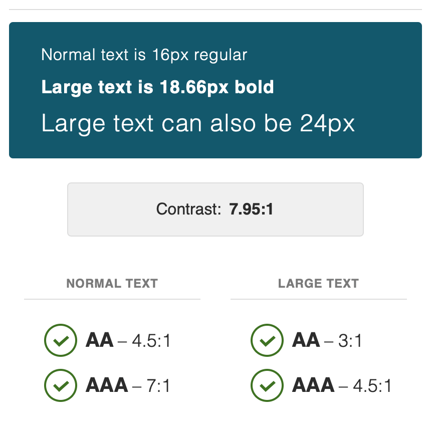
Contrast & Colors
All interaction component is checked to meet at least AA – 3:1 contrast ratio, and colorblind test.
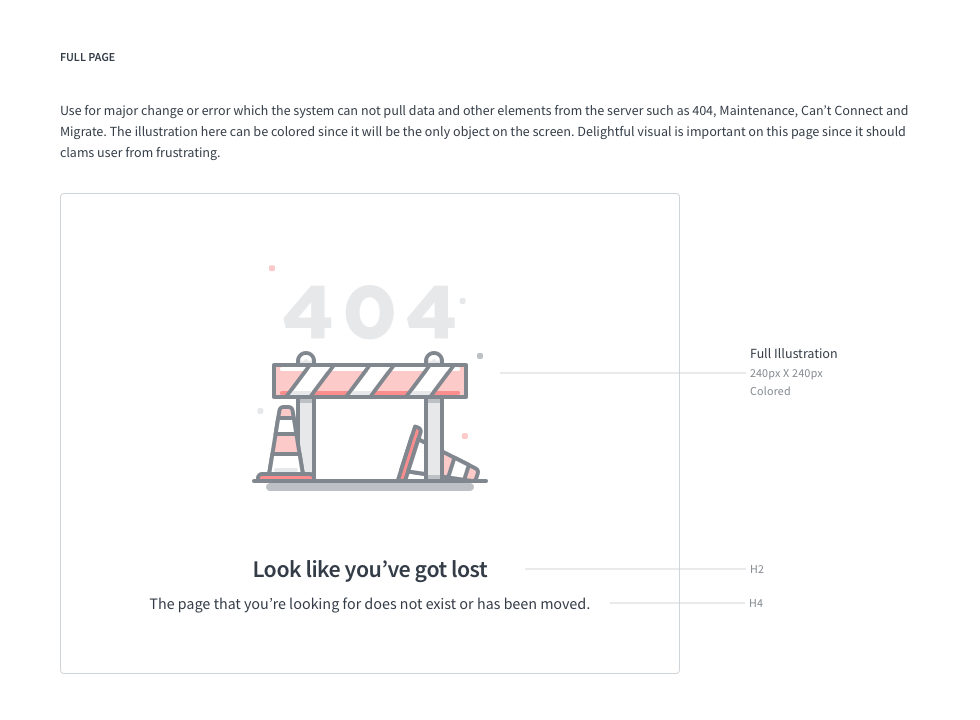
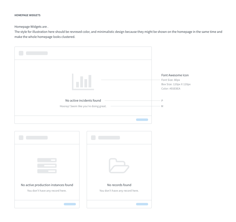
States
We made sure the user experience goes beyond normal experience. This includes empty states, error states, and more.
Collaboration
Collaborate with other designers to create new features. As a design system advocate, I made sure we reuse existing UX patterns and components in design library.
We documented and put the feature back into the design system to reuse again in other products or features.
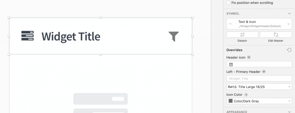
Smart Symbol Structure
I set up the smart symbols for designers to make their ideas come to life quicker, iterate faster, deliver with ease. These components are baked-in to the design token and engineers can put it together in an instant.
Responsive
Each component can be resize with 100% smart symbol.
Easy to use
Use Font Awesome for a larger icon library and updated it by professional team. Just copy and paste from the library.
Colors Masking
All visual component is done with baked-in colors masking. Allow designers to change color with ease.
Results
We were able to reduce the time the engineer would be guessing variables and mismatched grid structures.
The designers spend less time to ideate new design mockups.
The design process was improved and the development time went from 7 back-and-forth reviews down to 2 reviews.